

Chart Edition: Yellow Alert
Lots of Pictures this week....


The major U.S. indices saw a volatile week with the S&P 500 and Nasdaq Composite slipping below their 50-day moving averages, a technical yellow alert that underscores underlying investor concern. A strong earnings beat by market leader Nvidia Corporation didn’t translate into price strength — instead it appears to have triggered profit-taking and renewed questions about lofty valuations in the AI/tech space. The rally from the April low may have ended this past week and below I will present several charts that show a yellow warning light is now flashing.
Interest Rates and the Yield Curve
The week was also filled with multiple Fed officials speaking throughout the week, with markets closely parsing their remarks for clues about the December FOMC meeting. The consensus appears to be shifting toward a potential pause in rate cuts, with some officials emphasizing the need to see more progress on inflation before further easing. Fed funds futures showed decreased probability of a December cut as the week progressed.
In the chart below we can see the shape of the yield curve across all tenors. Over the last few months, the curve has shifted lower (yellow to blue line) while the left side of the curve reflects the drop in the Fed Funds Rate. We may be at an impasse as the solid September jobs numbers released this week signal the economy is ok. However, Consumer sentiment for November plunged to one of the lowest levels on record (University of Michigan index around 51, down from ~53.6 last month) amid high prices and soft income expectations. So, the signals are mixed.

As you can see below, the Consumer Price Index shows the Fed does not contain inflation and has made it worse with their massive balance sheet since.

Below is the current size of assets held by the Fed as part of their quantitative easing (QE) since the 2008 financial crisis. Keep in mind that QE is an inflationary exercise that was used to prop up asset prices in the financial crisis - it has lived well past its intended useful life. They have modestly reduced its size since the peak in 2022 but we are still $2.5T larger than pre-COVID.

Will the next Fed Chair begin to sell down these assets so we can normalize the interest rate complex? Will that be a disruptive exercise for credit and stock markets? Also, a balance sheet this large mutes the effect of interest rate changes (like a wet blanket) so incremental changes in interest rates have little real impact in this environment.
Stock Charts
I have several charts to review this week but the main exercise is to see how momentum is shifting to the downside. It is possible that we ended the uptrend from the April low and a weak start to next week’s trading would likely confirm this possibility.
First up is the S&P 500 Futures (December contract) that shows the overnight trading that doesn’t show up in the charts that reflect regular trading hours.
As you can see below, we have traded sideways since September and it looks this may be a head and shoulders topping pattern.
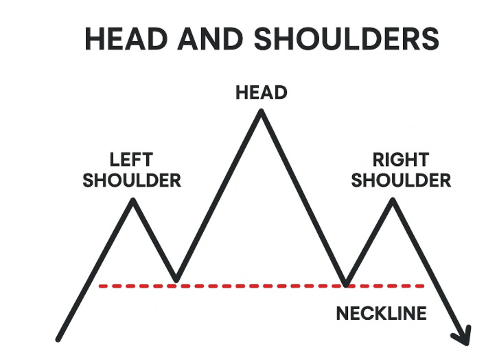
If true, we are on the verge of breaking the neckline for a tumble lower.

The S&P 500 Index below is trades during normal hours and may be showing us a diagonal pattern that has spent the last four weeks topping. The MACD momentum indicator on this weekly chart has flipped to the downside which we haven’t seen since the end of 2024.

Next is the equal weight S&P 500 ETF (RSP) that removes the higher weighted technology giants. You can see it barely moved above the 2024 high and looks to have lost upside momentum.

The QQQ technology based ETF is highly weighted to the largest technology companies. The most recent push higher also looks to be signaling lower prices.

Here is the star of the markets as Nvidia is the most valuable company in the world as their computer chips are a form of currency within the technology space. You can see that there has been a negative divergence building in the RSI indicator since January of 2024. The 61.8% FIB at $86.62 looks ripe to be retouched as this looks like a multi-year uptrend is at or near completion. But only a heretic would say that.

The pattern of Netflix is clearly in pullback mode. How far will we go?

Juggernaut Microsoft looks to be ‘adjusting’ its valuation - $350 area is a previous low and may be the downside target.

The Oracle of San Francisco is taking on lots of debt to build data centers and man that is quite the reversal (they come fast when they happen).

Bitcoin is considered a ‘risk’ asset like junk bonds or go-go stocks and this looks like some aggressive selling here. Eventually, this sentiment could spread to other riskier areas such as junk bonds and high-valuation stocks.

Tesla is in a multi-year correction and it looks like one more leg lower to complete this pattern. Their new product lines may be the rationale for a new uptrend (whenever that happens).

The big dog in semiconductor manufacturing, Taiwan Semiconductor, is showing signs of flipping into negative momentum. Notable is that they make Nvidia’s computer chips.

I’ll keep you updated on how things fare after Thanksgiving. Just keep in mind we need positive momentum early next week to turn around some of the corporate titans.
Thank you for being a subscriber!

President, Kisco Capital
Disclaimer: This publication is for general market discussion only. Please consult a financial advisor on buy or sell decisions.